The modern luxury watch industry thrives on nostalgia, but every so often a brand reaches further back than the usual mid-century well. The new Neo Frame Jump Hour from Audemars Piguet does exactly that, reviving one of horology’s most charmingly eccentric complications while channeling a reference from 1929 that only seasoned collectors tend to recognize on sight. The result isn’t just another heritage-inspired drop—it’s a calculated reminder that mechanical creativity didn’t begin in the sports-watch era.
The Jump Hour: Mechanical Theater Before It Was Cool
Long before digital displays defined modern timekeeping aesthetics, watchmakers experimented with numerical apertures. The jump hour—also called a “digital” display in early catalogues—emerged in the late 19th century and peaked during the Art Deco period. Instead of rotating hands, the hour appears in a window that snaps instantly to the next numeral at the top of the hour, driven by a tensioned spring and star wheel mechanism.
That instantaneous change is deceptively complex. Unlike a dragging hour disc, a true jump hour requires stored energy released precisely at 60 minutes, demanding careful torque management to avoid amplitude drops. Historically, this meant jump hours were niche pieces: mechanically clever, visually striking, but difficult to execute without compromising reliability.
Their heyday arrived in the 1920s and ’30s, when geometric case designs and experimental displays aligned with the modernist aesthetic. Then they largely disappeared, pushed aside by round cases and central-hand orthodoxy. Today, the complication’s rarity is exactly what makes it compelling to collectors.
A Ghost From 1929: The Influence of Reference 1271
The Neo Frame’s conceptual ancestor is Audemars Piguet’s reference 1271, introduced in 1929. It was rectangular, architecturally minimal, and featured a jumping hour paired with a trailing minutes display—an unconventional layout even by period standards. Only a handful were produced, making surviving examples auction darlings and scholarship pieces rather than everyday collector targets.
What made the 1271 special wasn’t just scarcity. It captured a moment when watch design flirted openly with industrial modernism: sharp lines, graphic symmetry, and an embrace of negative space. In retrospect, it looks less like a vintage curiosity and more like a prototype for contemporary avant-garde design language.
The Neo Frame doesn’t copy that watch. It translates it.
Neo Frame Jump Hour: Specifications and Architecture
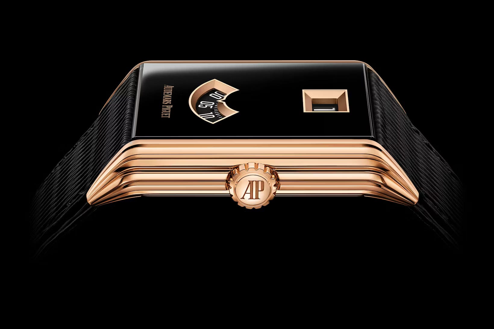
The new model adopts a dramatically openworked rectangular case—architectural rather than ornamental—crafted in pink gold and measuring roughly 39mm by 29mm. The proportions deliberately echo historical form watches rather than modern sports dimensions, yet the execution is unmistakably contemporary.
Time is displayed through three apertures: jumping hours, wandering minutes, and running seconds. The numerals appear on rotating discs, sharply printed for legibility against a darkened backdrop. The effect feels halfway between vintage dashboard instrumentation and modern digital minimalism.
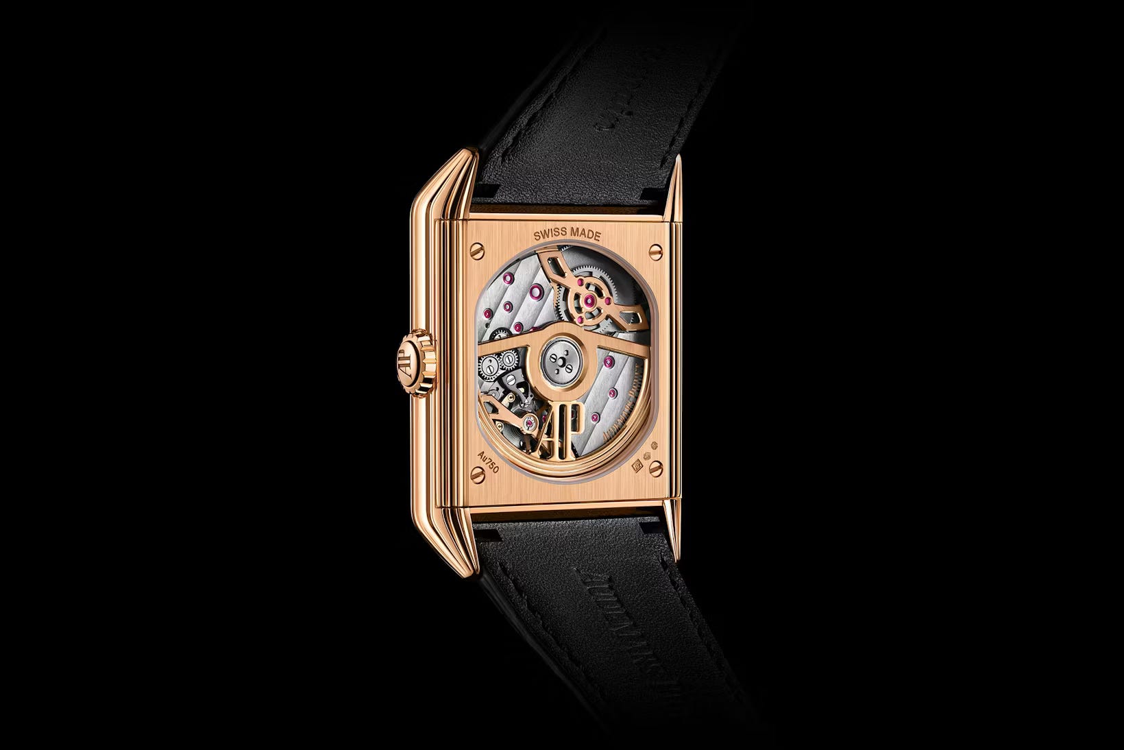
Inside beats a manually wound manufacture movement developed specifically for this display. It’s designed with a constant-force mechanism dedicated to the jumping hour module, ensuring the instantaneous change doesn’t rob the balance of amplitude—a traditional engineering challenge addressed with modern tolerances.
Power reserve sits around 48 hours, a pragmatic choice given the energy demands of the complication. Finishing is classic haute horlogerie: anglage along bridges, polished countersinks, and a level of handwork that reinforces the watch’s positioning as a connoisseur’s piece rather than a novelty complication.
Design Language: Where Brutalism Meets Art Deco
Visually, the Neo Frame is striking because it resists easy categorization. The case architecture feels almost Brutalist—structural, linear, unapologetically mechanical—while the dial layout nods to Deco symmetry. That tension is intentional. The watch isn’t trying to look vintage; it’s exploring what vintage futurism looks like when rendered with 21st-century finishing standards.
Collectors who handle it will likely notice something else: legibility. Jump hours can be quirky but impractical. Here, the numerals are oversized, crisp, and framed in a way that naturally draws the eye from hours to minutes. It’s playful, yes, but also surprisingly functional.
Why Collectors Are Paying Attention
Complication revivals happen often. What’s rarer is when a major manufacture resurrects a display style it hasn’t meaningfully revisited in nearly a century. That alone gives the Neo Frame a certain gravitational pull among enthusiasts who value archival continuity as much as mechanical merit.
There’s also the broader market context. In an era saturated with steel sports watches and incremental dial variations, collectors are increasingly gravitating toward pieces that feel conceptually fresh. Independent brands have thrived in this space; heritage houses have sometimes lagged. Releases like this suggest that the gap may be narrowing.
The Quiet Significance of a Niche Complication
The Neo Frame Jump Hour won’t be a volume seller, nor is it meant to be. Its importance lies elsewhere. It demonstrates that historical complications can be revived without becoming costume pieces, and that archival references can inspire rather than constrain modern design.
In a landscape where so many watches compete for attention through size or material gimmicks, this one stands out by doing something subtler: it tells time differently. And in horology, that’s often the most persuasive innovation of all.